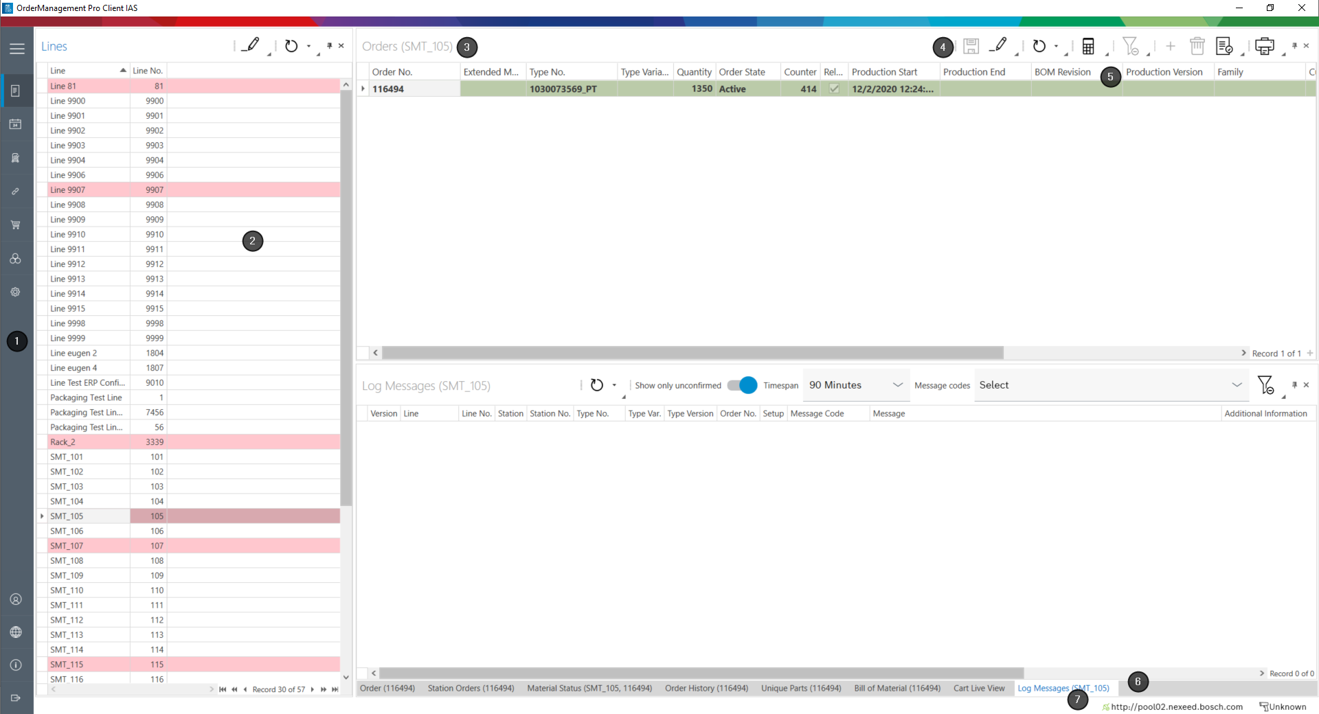
|
Menu |
|
Panel/window |
|
Window title |
|
Toolbar |
|
Table header |
|
Hidden windows |
|
Status bar |
Menu
In the menu, the menu options are used to open the functions that are displayed on the main screen.
The menu can be maximized with  and minimized with
  .
.
The following menu options are displayed:
Menu option |
Description |
|---|---|
with job overview |
Create and manage orders |
Graphical Order Display |
View the orders in the calendar, for a quick overview of the status of the orders |
Cart Management |
Create and manage setup facilities |
Splice Prediction |
Display splicing information, for example information about material, line and station, splicing reserve, estimated time to next splicing |
Material Orders |
View and manage material orders for lines |
Material Handling |
View and manage material replenishment for lines |
Admin settings |
Configure the desktop client |
admin |
Log on as an administrator. |
Select Language... |
Select the language for the desktop client. |
About... |
Information about the desktop client, for example display version, manufacturer, and contact information. |
Exit |
Exit the desktop client. |
Panel
The main screen is made up of panels. They are outlined with a thin gray line. One or more windows are assigned to a panel. Only one window is displayed at a time. The title of windows that are not displayed is shown at the bottom of the panel. Click on the window title to open the window.
Panels can be fixed, in other words always displayed or hidden. The title of hidden panels is displayed on the right side of the menu. Hidden panels can be opened by clicking on the title.
Right-clicking on the window title opens a context menu, which can be used to arrange panels as required. The customized layout can be saved.
Basic operation: Layout of the main screen
Window
The menu-specific contents are displayed and edited in windows. A window has a title and a toolbar. The contents are displayed in the form of tables or graphs.
Basic operation: Setting up tables
Toolbar
Each window has a toolbar with buttons for operation. Additional buttons can be added using the small triangle in the lower right corner of an icon.
Basic operation: Setting up the toolbar
The following symbols are often used:
Symbol |
Description |
|
Add an item to the window. |
|
Save all changes in the window. |
|
Enable editing. If editing is enabled, changes can be made in the window (e.g. Lines window: Switch the selected line to maintenance mode). |
|
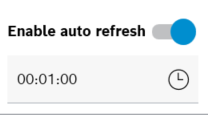
Update the data in the window. The tooltip shows the time of the last update. The downward triangle next to the icon opens a pop-up window to enable the automatic update.
The automatic update is activated with the switch and the activation interval (hh:mm:ss) is adjusted using the keyboard or using |
|
Check the saved settings for contradictions. The results are displayed in a separate message window. If there are conflicting settings, they are sorted by line. |
|
Delete the selected item in the window. Items can only be deleted if editing is enabled with |
|
Remove all filter criteria applied in the window. A dialog box for entering the filter criteria can be opened using the context menu of the table header. |
|
Open the print preview for the window. |
|
Automatically hide or always display the panel/window. The title of a window that is automatically hidden appears on the edge and can be displayed by moving the mouse over it. |
|
Close the panel/window. The title of the panel/window appears at the edge of the panels. A closed panel/window can be displayed again by clicking on the title. |
Table header
The table header displays the column titles of a table. Right-clicking on the table header opens a context menu that can be used to adapt the table (e.g. displayed columns and sorting).
Basic operation: Setting up tables
Status bar
The status bar shows the status of the connection to the database and scanner.
Scanners can also be set up using the status line.


 , and
, and  .
.